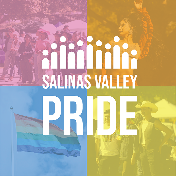
Salinas Valley Pride Celebrations
Problem
SVPC lacked a defined graphic standard and cohesive brand identity. The organization wanted to better communicate its mission and strengthen how it was perceived within the greater Salinas Valley community.
Audience
LGBTQ+ community members in the Salinas Valley, including individuals seeking safe, inclusive spaces and community-centered programs.
Solution
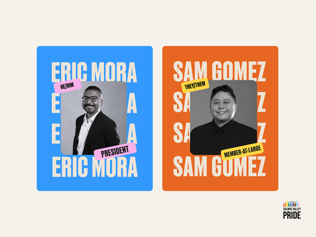
To understand the organization’s vision, I attended board meetings and facilitated brainstorming sessions with leadership to shape the brand narrative. Together we identified key values: celebrating joy, creating inclusive and safe spaces, and fostering community.
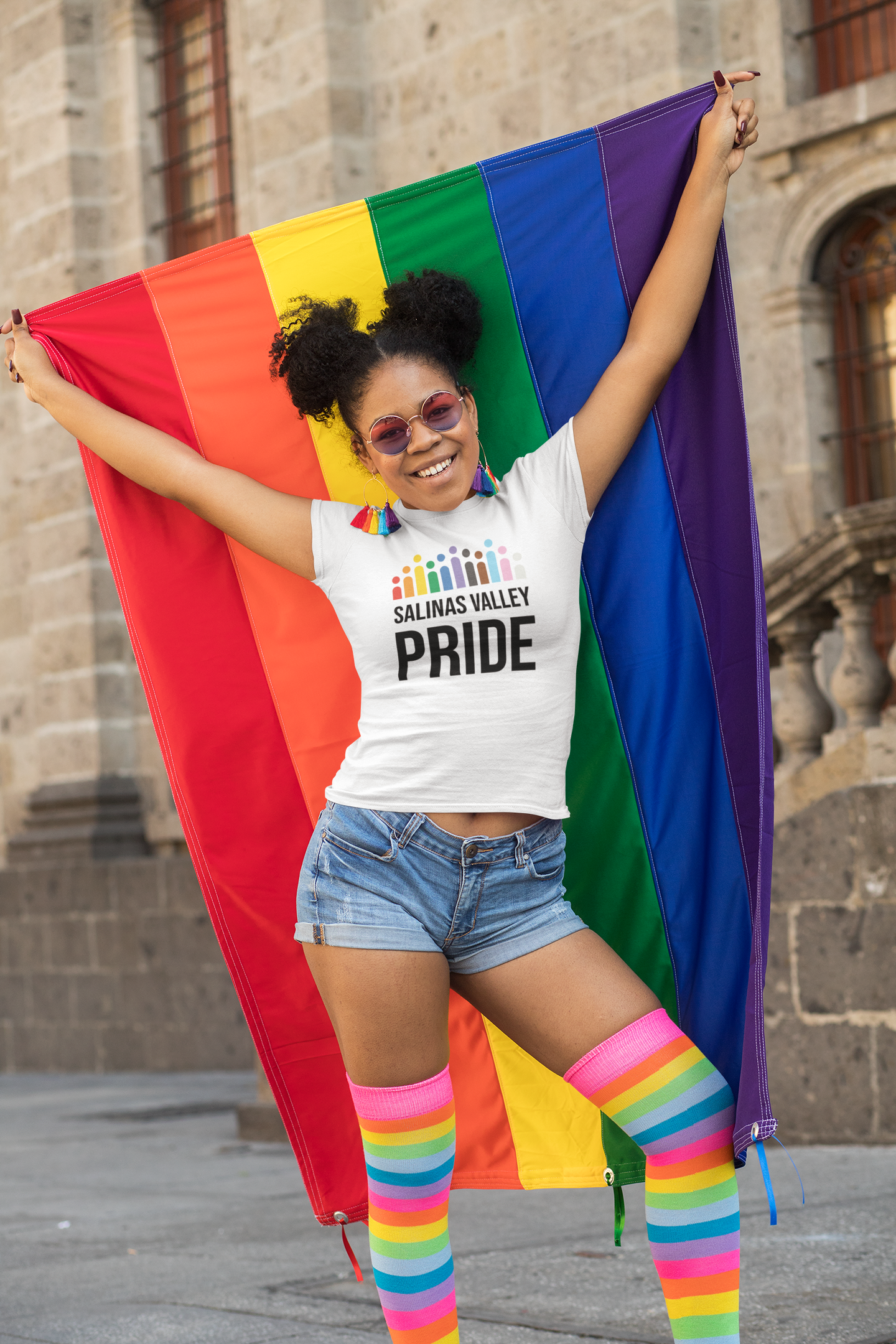
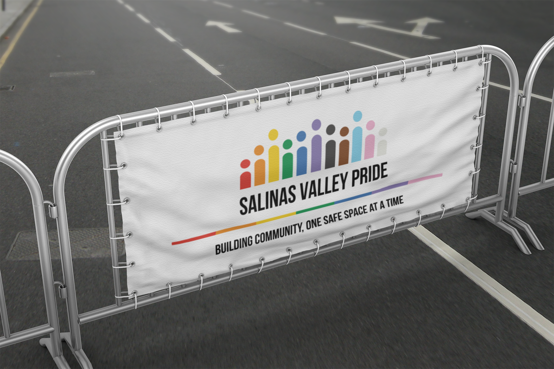
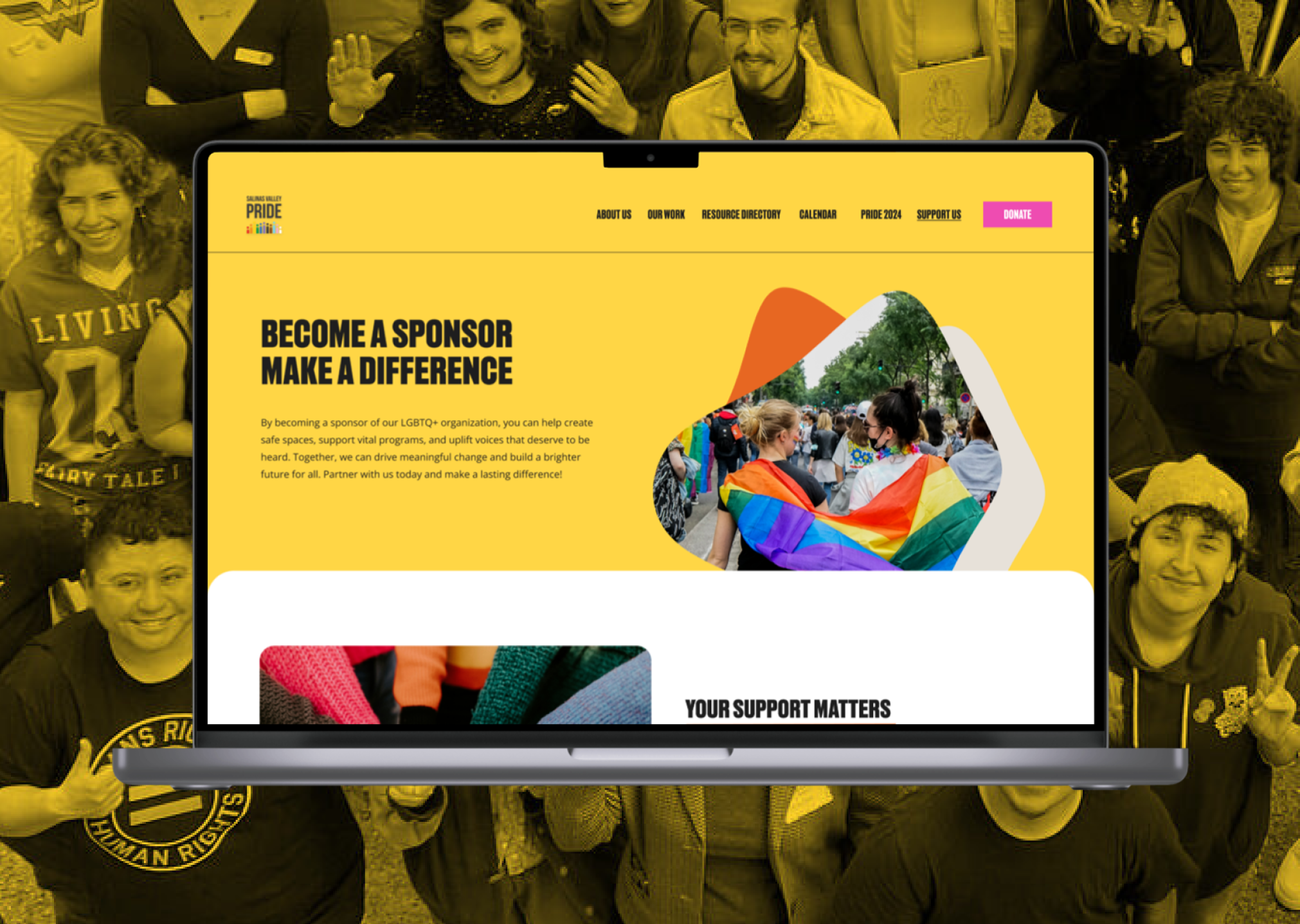
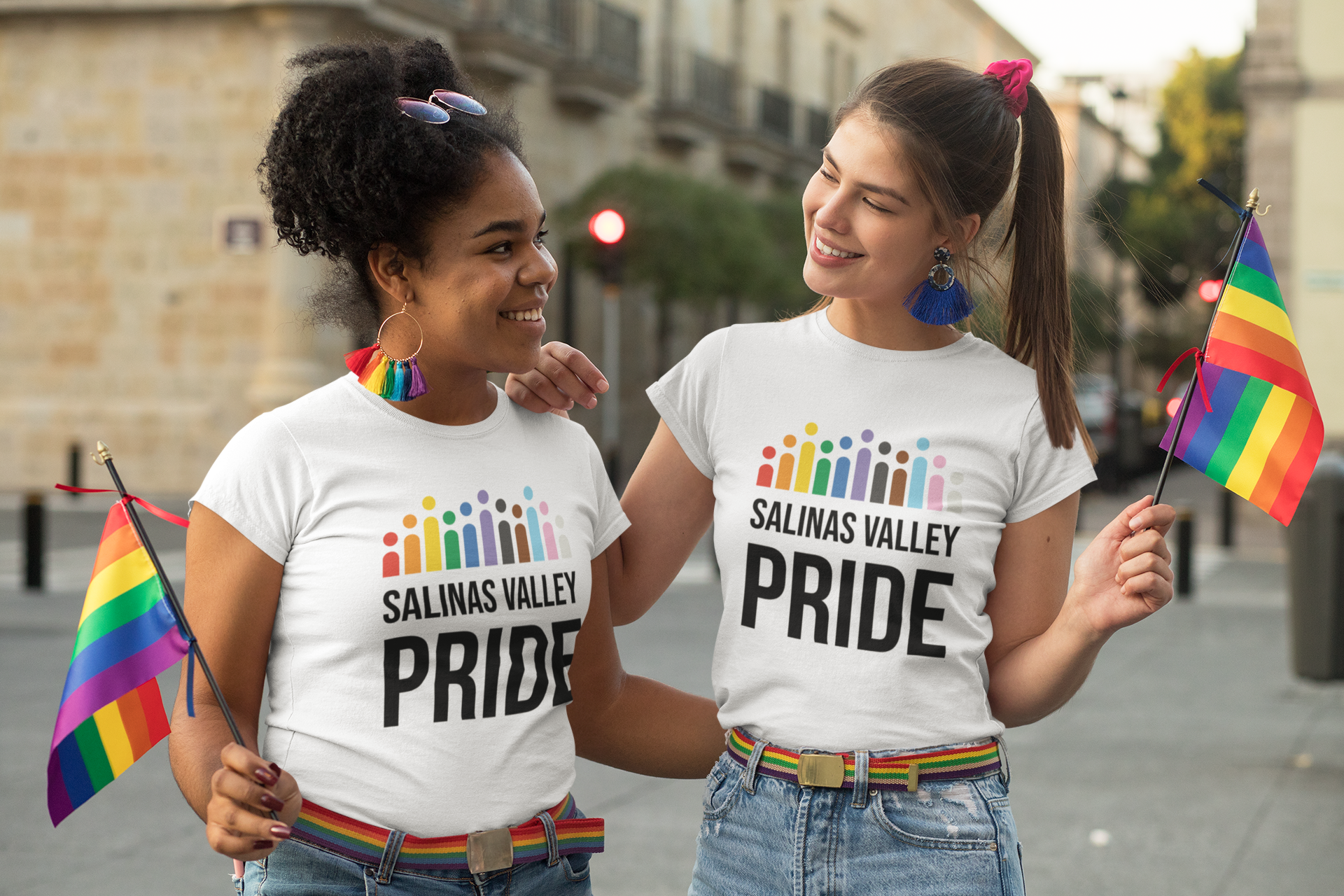
Building on these insights, I developed a new visual identity system. I introduced a bold color palette balanced with neutral tones. Pink, blue, and off-white referenced the trans community, while orange and yellow conveyed warmth, joy, and celebration. I paired Recent Grotesk, a bold display typeface, with Manrope, a clean modern sans-serif, creating a flexible typographic system for both digital and print applications.
Process
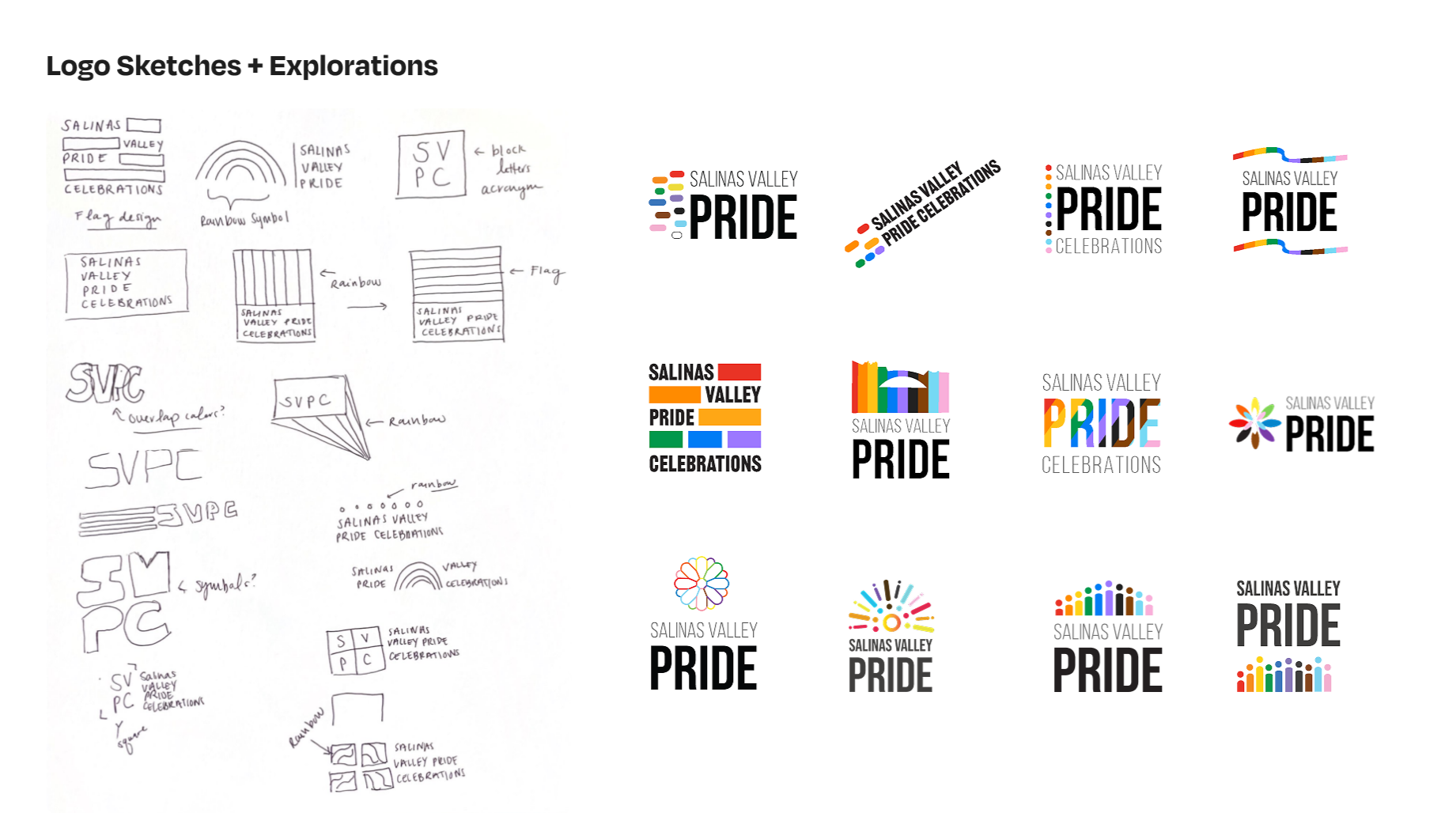
I presented initial sketches to the marketing committee for feedback. The group agreed on the need for a strong symbol that reflected Salinas. I revised the designs, ensuring the final logo stood apart from existing regional logos and was distinctly tied to Pride.
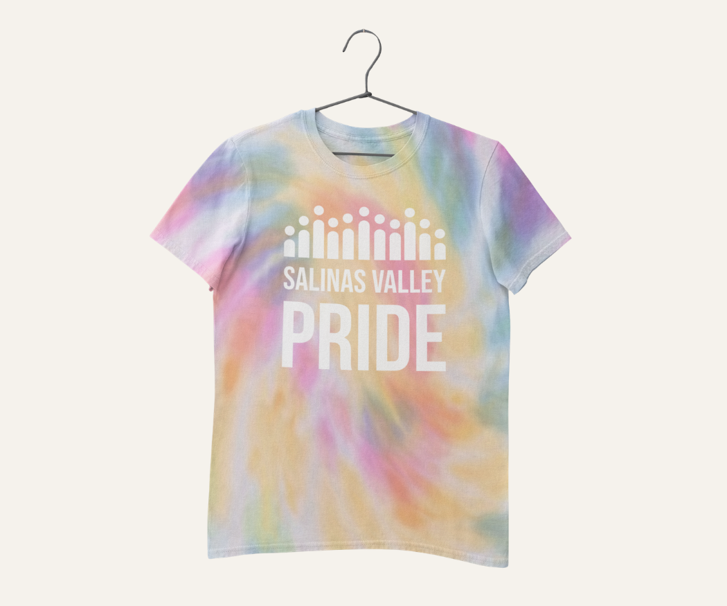
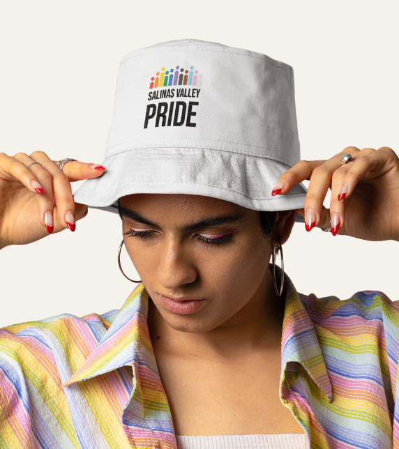
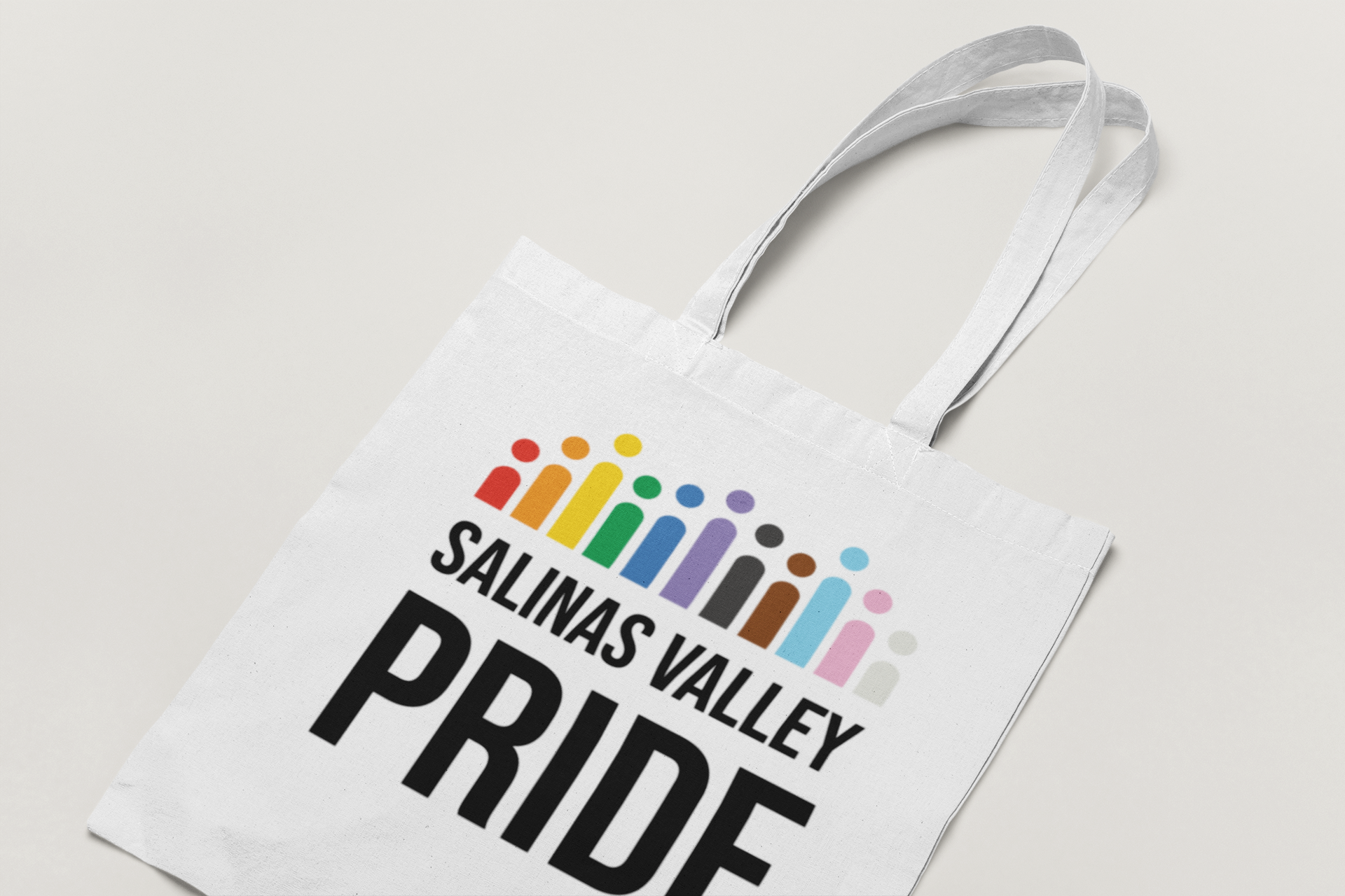
To honor the diverse community SVPC serves, I incorporated the progressive Pride flag colors, symbolizing inclusivity. The logo's depiction of people at varying heights represented the Salinas Valley's mountains, reinforcing the idea of a united, supportive community.


Explore more work
-
![]()
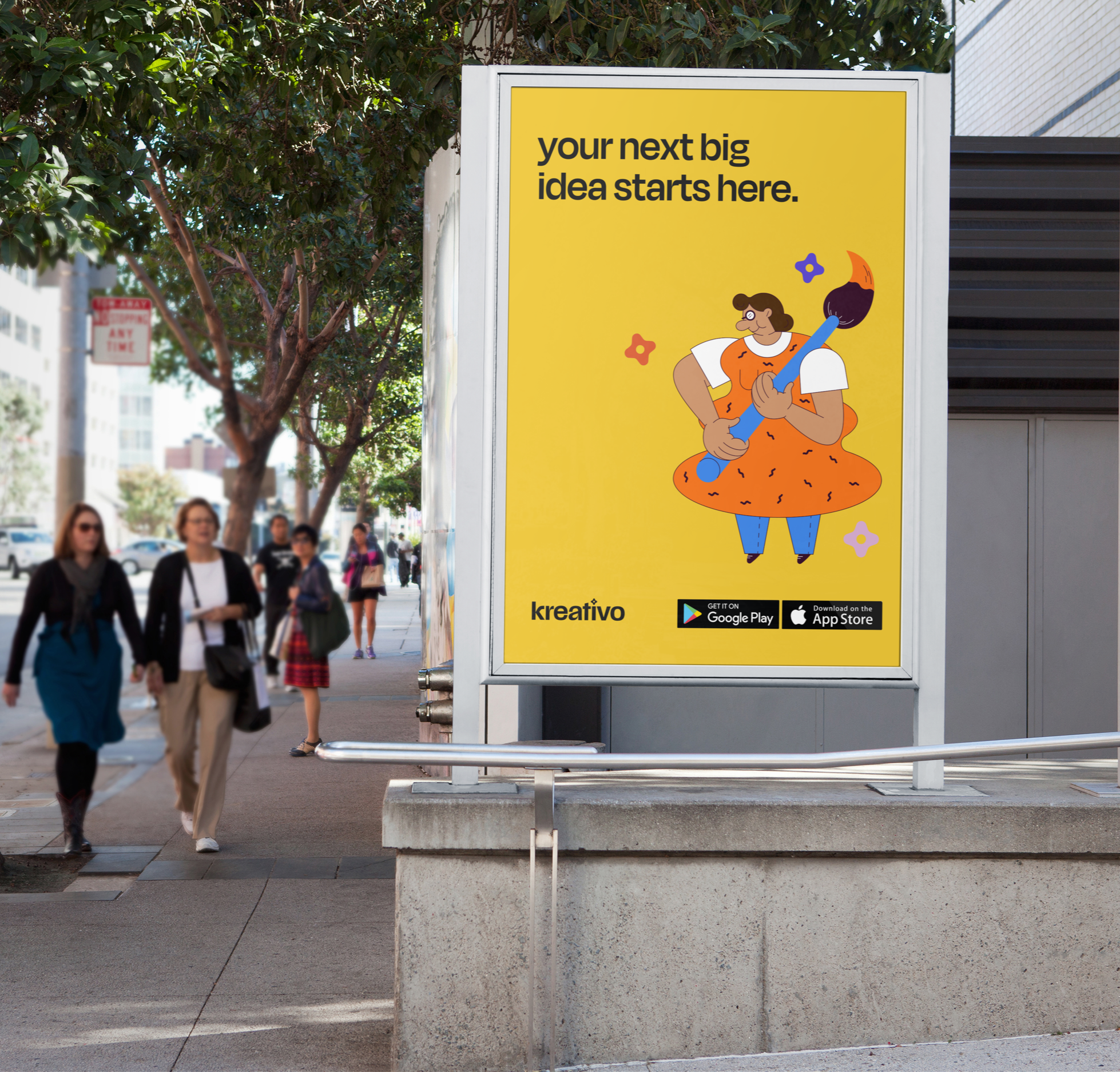
Kreativo
Visual Identity
-
![]()
Let's Jam
Cannabis Products
-
![]()
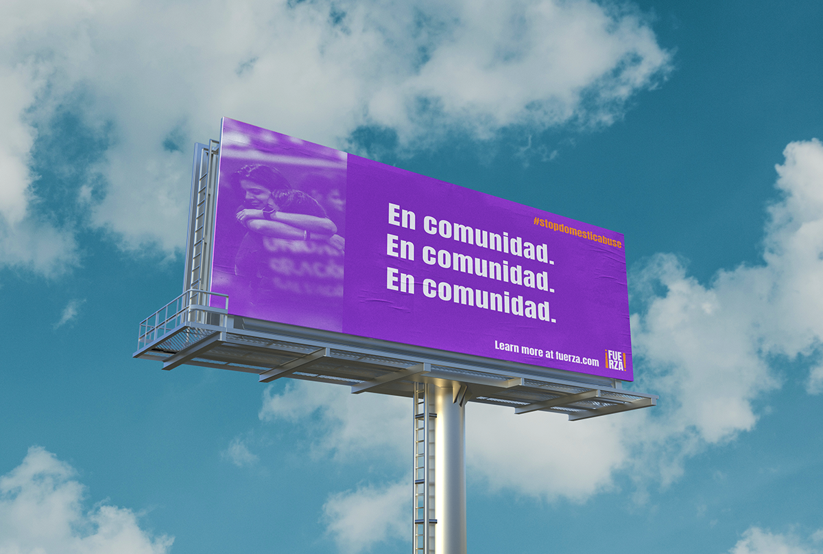
¡Fuerza!
Campaign Development