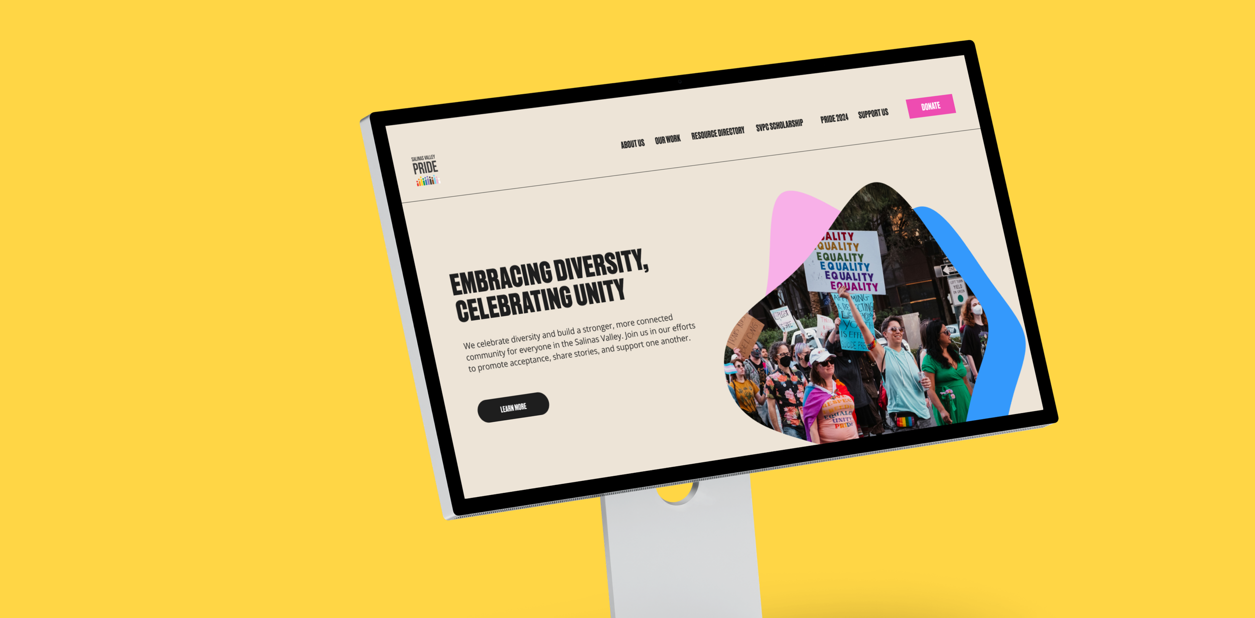

SVPC Responsive Web Design
Role
UX Designer, UX Researcher, Branding/UI
Competitive Analysis, User Interviews, Card Sorting, Wireframing, Branding, Logo Design, Style Guide, Responsive Design, Prototyping
Methods
Client Project
Redesign a responsive website for Salinas Valley Pride Celebrations.
Scope
6 months (March 2024-August 2024)
SVPC: Uniting, Celebrating, and Supporting LGBTQIA+ Voices
BACKGROUND
Salinas Valley Pride Celebrations is a volunteer-driven nonprofit dedicated to supporting the local LGBTQIA+ community. They foster safe spaces through social events, community partnerships, scholarship programs, and by organizing their annual Pride celebration each October.
I reached out to SVPC as a community member passionate about their mission. In my conversation with the current president of the board, we discussed how the organization could enhance its presence and amplify its message through an updated website to showcase the organization's valuable contributions.
Transforming SVPC: Redesigning for Impact and Identity
I developed a timeline for the research and testing phase of the website redesign, while also creating a fresh visual identity for the board to review. To gain a deeper understanding of the organization and gather direct feedback, I started attending their monthly meetings, where I shared updates on the project's progress.

Problem
The organization lacks a clear brand identity creating a disconnect between their mission to attract new members, volunteers and sponsors.
Lack of Strong Identity & Branding: The organization lacks a defined branding identity or standard resulting in a website design that feels disconnected from their mission.
Information Architecture: The current layout makes the website difficult to navigate along with the excess of information that overwhelms users.
Donations CTA: Website does not have an emphasis on donations within the design layout and does not have a form to easily fill out.
Language Barriers: There are no translations for Spanish speakers to navigate the website despite living in a region where there are Spanish speakers in the community.
Solution
Design a responsive website that reflects SVPC’s values and mission through a compelling visual identity and an intuitive, user-friendly structure.
Designing a Responsive Website that Reflects SVPC’s Values and Mission
SOLUTIONS
SOLUTION 01
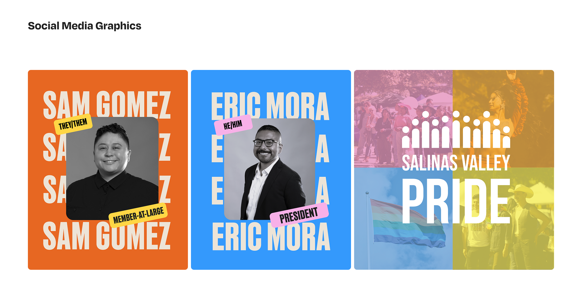
Meet the Board
Users can learn more about SVPC's current board members, gaining insight into their roles and encouraging new members to get involved.

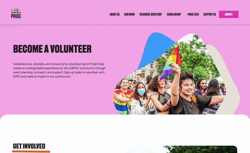
Users interested in supporting the organization can sign up to volunteer for SVPC's annual Pride Celebration.
Volunteer for Pride
SOLUTION 02
SOLUTION 03
Make a Donation
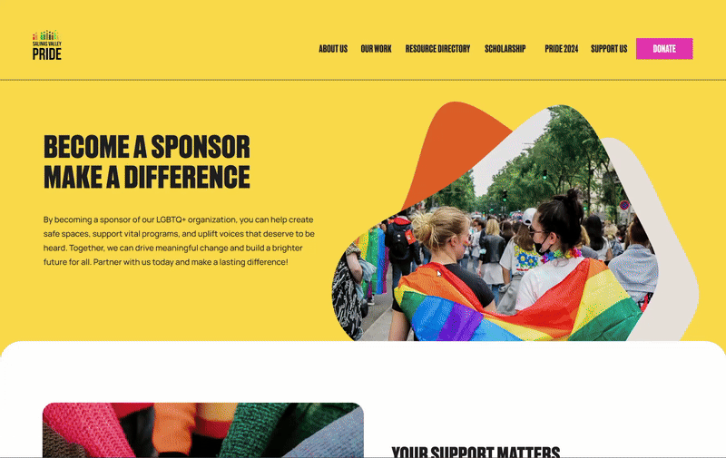
Users can donate to the organization or choose to become long-term sponsors to support its continued efforts.
SOLUTION 04
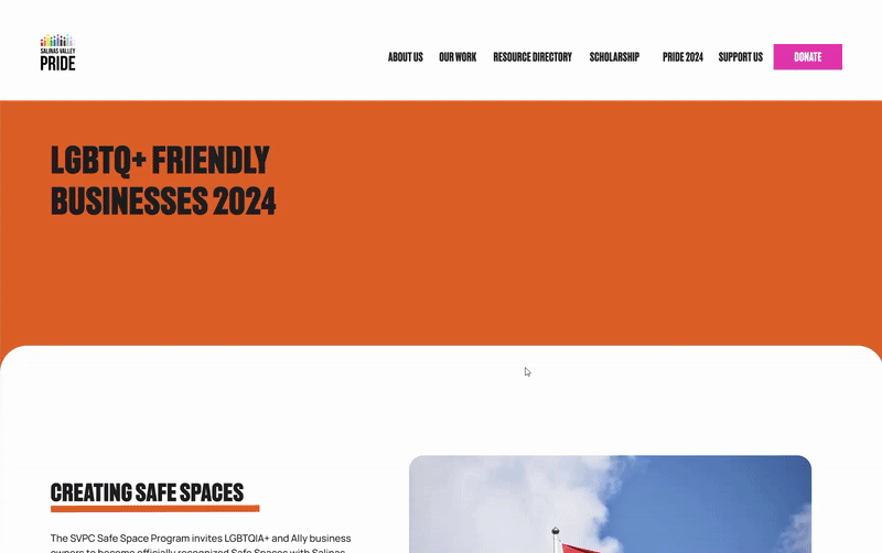
Resource Directory
Users can access a directory of businesses that are either queer-owned or actively support the LGBTQ+ community as safe spaces or allies.

Empathize
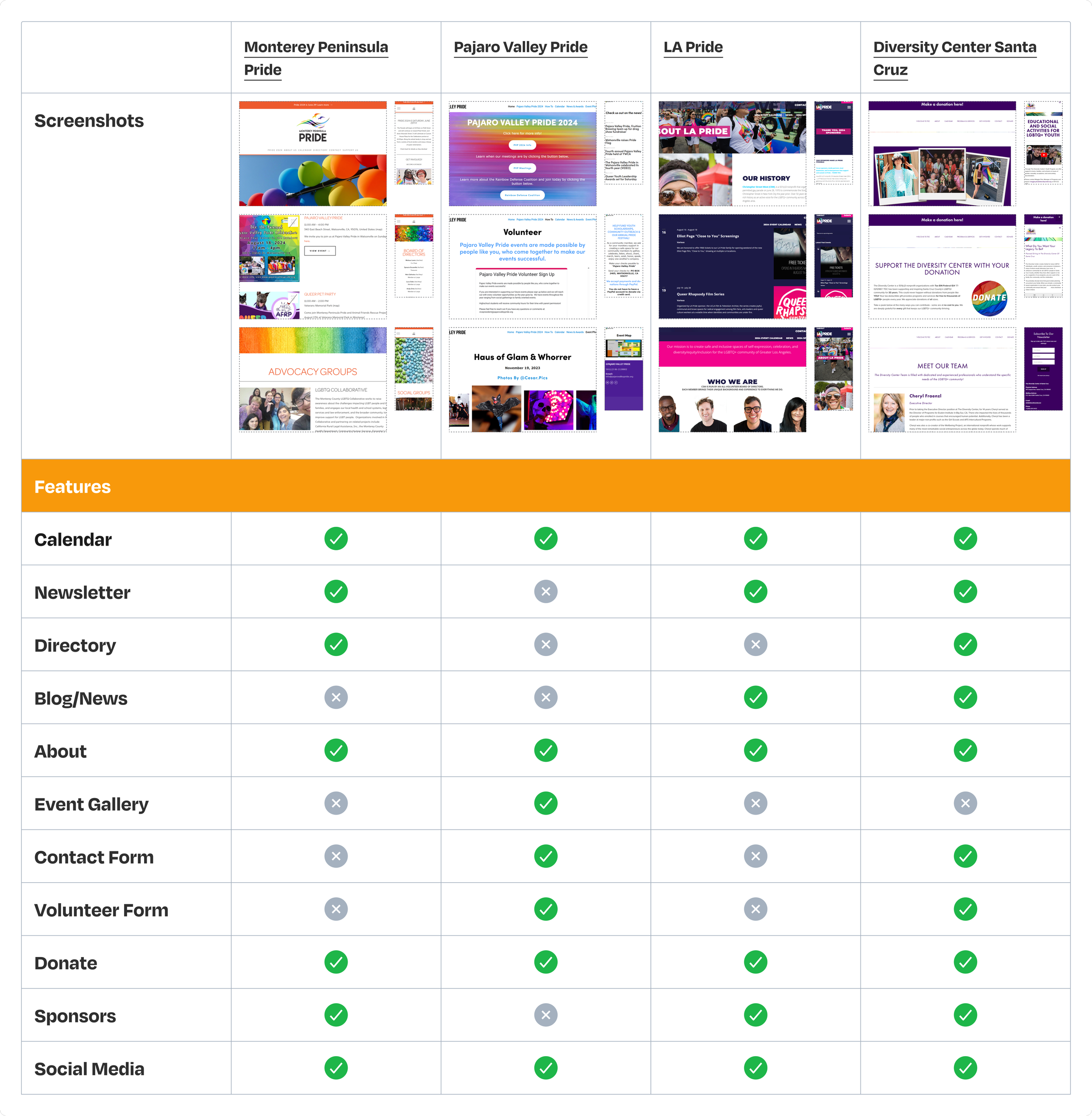
COMPETITIVE ANALYSIS
Boosting SVPC's Web Presence: Key Insights from LGBTQ+ Orgs
I started my research by examining existing LGBTQ+ organizations to identify features SVPC could incorporate into their new website, enhancing engagement and visibility within the community. The organizations maintained a consistent layout in their navigation, providing resources, information about pride events, details about the organization itself, and ways to donate or sponsor their efforts.
Through my research, I discovered that competitors like LA Pride excelled with a strong visual identity and intuitive navigation. Other organizations also offered seamless sign-up forms for volunteering or subscribing to newsletters. These features were notably absent from SVPC’s website and could be implemented to enhance the user experience and elevate the site.
Listening to the Community: Researching LGBTQIA+ Experiences
USER INTERVIEWS

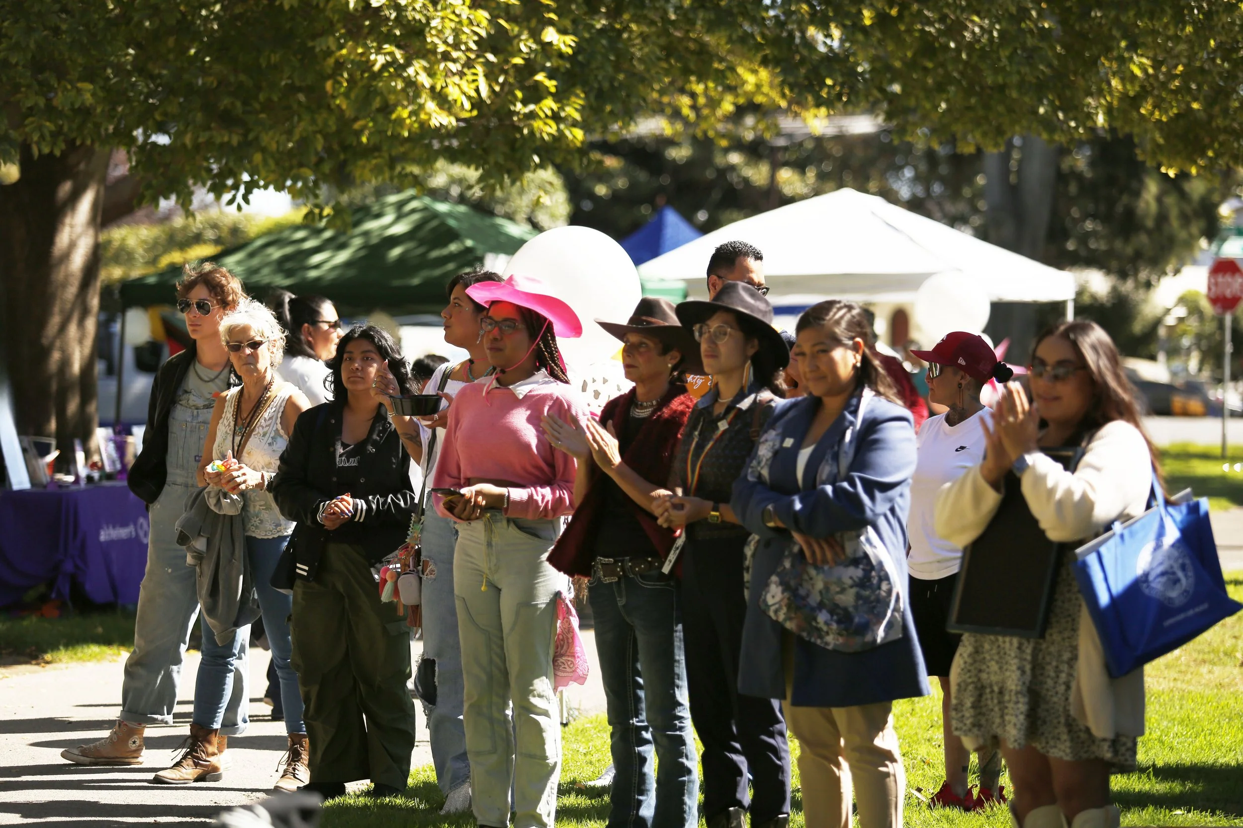
I interviewed 5 participants (ages 30-38), including 2 SVPC Board members, 2 LGBTQ+ individuals, and 1 LGBTQ+ ally. The interviews were split into two guides: one for the board members to explore their experiences with SVPC and website goals, and another for community members to share their experiences attending Pride events and supporting the LGBTQ+ community.
The majority shared their motivation of attending Pride and engaging with LGBTQ+ organizations stemmed from a desire to stand up against hate. They all expressed being part of a community whether through attending social events or participating in their own campaigning.
Website Audit: Improving Navigation, Design, and Engagement
Auditing the website with the SVPC President and Vice President gave me the opportunity to ask clarifying questions about the current site. They highlighted key initiatives they wanted to emphasize, such as their Safe Space Program, upcoming Pride events, and the Scholarship Program.
The second part of the interview involved a website audit to gather participants' initial impressions and feedback. I guided community members through the current website, reviewing existing pages to identify areas for improvement. Participants identified 4 key issues with the existing website.
PROBLEM 01
Lack of Strong Visual Identity
Participants emphasized the need for a stronger visual identity, noting that the mismatched fonts and colors felt overwhelming. The images on the website appeared outdated and didn’t align with the organization’s mission.

PROBLEM 02
Information Overload
The majority of participants agreed that the LGBTQIA+ Directory page, along with others, needed restructuring due to the overwhelming amount of information and difficulty navigating it.

PROBLEM 03
Volunteer Page: Clarifying Tasks
Participants felt the Volunteer page lacked details about the tasks they would be performing during Pride and found the distinction between the "Volunteer at Pride!" and "Table at Pride" buttons confusing.

PROBLEM 04
Improving the Donation Page
Participants found the current Donation page untrustworthy due to the visuals, suggesting that including recommended donation amounts and an easy-to-use donation form would improve the page’s credibility.

Restructuring SVPC’s Navigation
To start restructuring the information architecture of SVPC’s website, I conducted an unmoderated hybrid open card sort with 5 participants (ages 18+). The card sort included 35 cards across 7 predefined categories, with participants also given the option to create new categories.
Average Completion Time→ Participants took an average of 8 minutes to complete the card sort.
Key Categories→ All 5 participants agreed on the categories: History, Our Board, Donate, and Sponsor. The majority agreed on: Volunteer, Join a Committee, Mental Health, Physical Health, 2024 Sponsors, Event Map, and Table at Pride.
New Categories→ Participant #2 created new categories: Gallery/Socials, Updates/Upcoming Events, and Resources. Participants #2 and #5 both created the "Events" category.
Excluded Cards→ Participants #3 and #4 did not place any cards under "Contact” category.


Define
Lila The Everyman & Alex The Creator
USER PERSONAS
Based on insights from the user interviews I conducted, I developed the following personas that represent the key audience for the website.
Lila The Everyman: A community member eager to build new connections but unfamiliar with available resources, feeling overwhelmed by the lack of structure on local organizations' websites.
Alex The Creator: An activist deeply committed to supporting the LGBTQ+ community through his organization's work, but the current website identity and structure do not accurately reflect their mission or values.


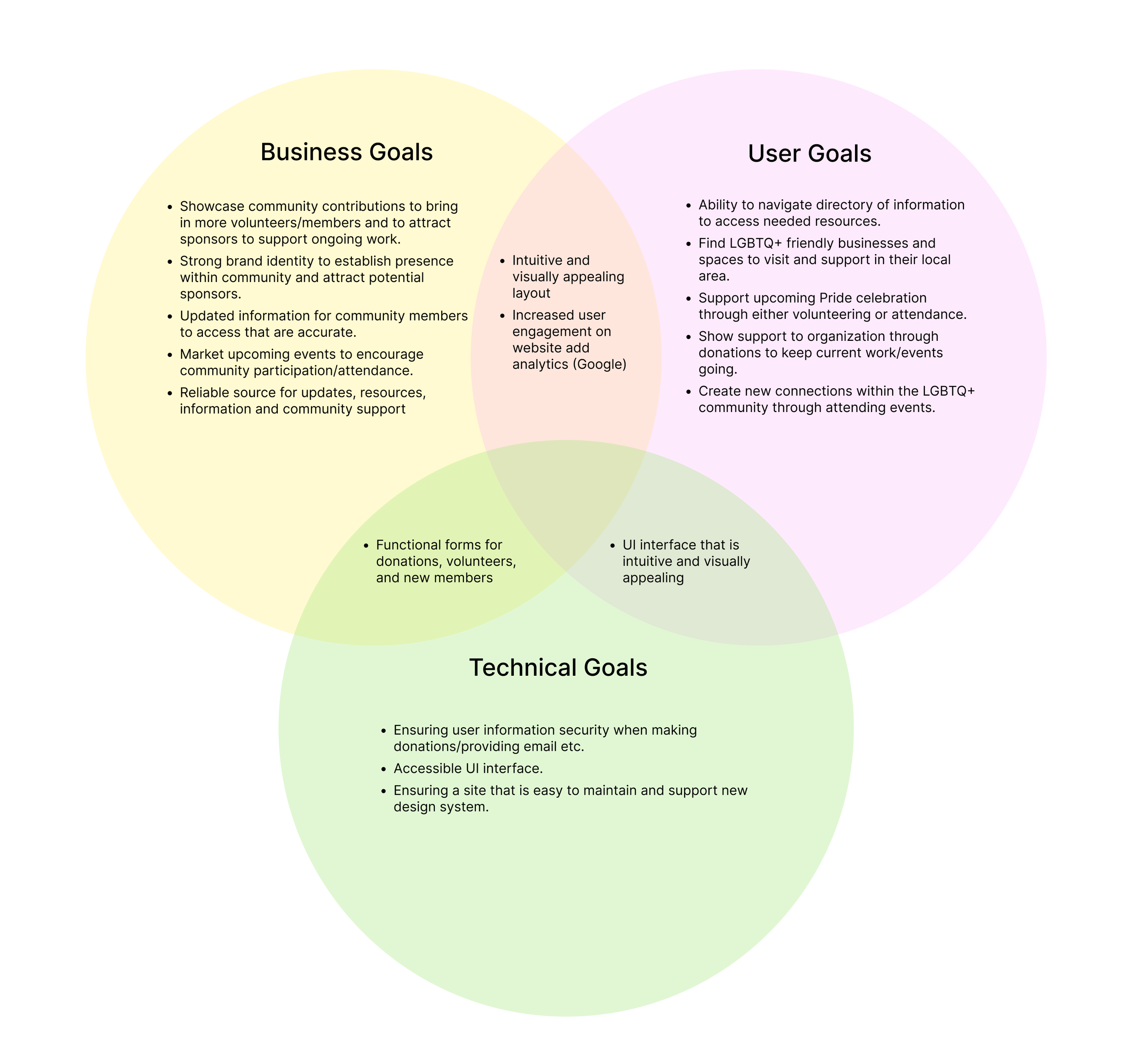
Aligning on SVPC’s Project Goals
I had the opportunity to meet with the SVPC Board to discuss their objectives for the new website to strategize our next steps. We developed a plan to revitalize SVPC’s brand identity, as feedback from community members indicated that its outdated appearance was hindering the organization from attracting its desired audience. Once the visual identity was established, we were able to begin restructuring the website's navigation to streamline the processes of joining the organization, volunteering, and donating.
Key Goals
Cohesive Branding Identity→ Redesign Salinas Valley Pride Celebration’s website and brand identity to reflect their mission and increase community outreach.
Improved User Experience & Navigation→ Developing a navigation that allows users to find information on resources with ease.
Updated Directory→ Organize existing resources and add new additions for directory.
Highlight Fundraising Efforts→ Bring in more donations from sponsors for the organization to fund future events.

Ideate
Navigating through SVPC’s Website
IDEATE
The following user stories were used as a foundation to create user flows, guiding users through the navigation of Salinas Valley Pride’s website.
01
“As a user I’d like to sign up to volunteer for SVPC’s upcoming Pride Celebration.”
02
“As a user I’d like to give a donation to SVPC to support their efforts of uplifting the LGBTQ+ community.”
03
“As a user I’d like to find local businesses that are queer owned or support the LGBTQ+ community.”
User Flows
I created three main user flows based on user stories: volunteering for Pride, making a donation, and navigating the LGBTQ+ business directory. These flows helped me visualize how to structure the information, ensuring users can easily navigate and complete tasks while accounting for all possible pathways.
Flow #1: Volunteer at Pride
Flow #2: Make a Donation
Flow #3: Navigate through LGBTQ+ Friendly Business Directory
Site Map
Based on the results from the card sort, I created a sitemap to structure the website’s navigation. I incorporated the terms suggested by participants to ensure a more intuitive user experience. Below is the updated sitemap, incorporating the final revisions based on feedback from the board.

Wireframes
Low Fidelity Wireframes
After defining the user flows, I started sketching layouts for key pages, including the landing page, meet the board, volunteer section, LGBTQ+ business directory, and sponsor page.


DESIGN
Mid Fidelity Wireframes
I then translated the sketches into mid-fidelity wireframes, adopting a modular design approach. The LGBTQ+ Friendly Businesses page became the primary focus due to the large volume of information, ongoing discussions with the board about categorizing the businesses, and the need to update the existing list. Wireframing in mid-fidelity accelerated the process of making changes, allowing me to quickly iterate and arrive at an effective solution for organizing the page.


Mid-Fidelity Testing
Participant Insights: Unmoderated Testing of Mid-Fidelity Designs
MIDFIDELITY TESTING
For mid-fidelity testing, I conducted an unmoderated session where participants provided feedback on the initial designs. A total of 5 participants, aged 18+, were asked to complete 4 task flows: Landing/Meet the Board, Navigate LGBTQ+ Business Directory, Donate to SVPC, and Volunteer for Pride.
After completing the task flows, participants were asked to rate the difficulty of each task and offer suggestions or comments on the pages they reviewed. All 5 participants successfully completed all 4 tasks, with the majority rating the task difficulty around 1-2 (not difficult).
REVISION 01
Add Search Bar Feature
During mid-fidelity testing, one user suggested adding a search bar feature alongside the existing filter to help users find businesses more quickly.

“Back to Home” Option
REVISION 02
Another suggestion from users was to add a "Back to Home" option on both the Donation and Volunteer pages once the task was completed.
REVISION 03
Active Navigation State
To help users navigate and understand their location within the site, participants suggested adding a visible active state to indicate the current page they were on.

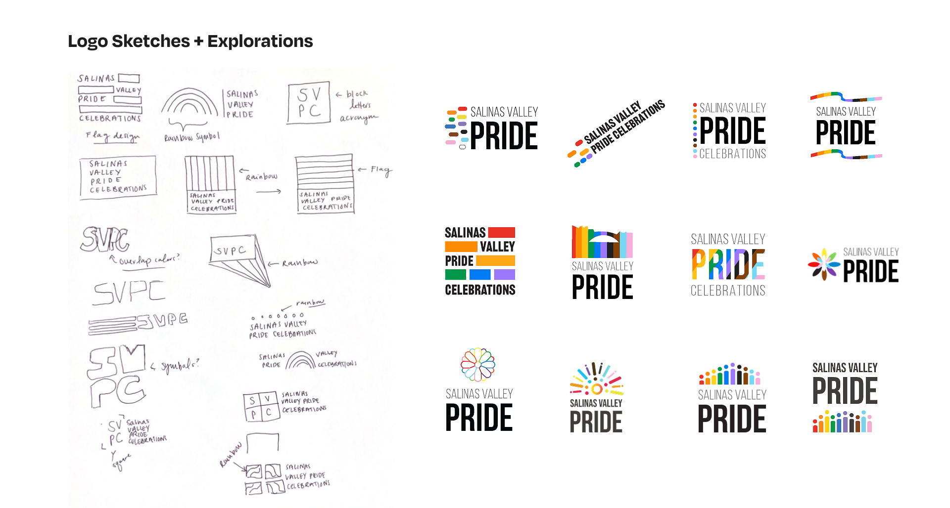
Branding
Bringing It All Together. With A Bold New Look!
VISUAL STYLE GUIDE
To gain a deeper understanding of the organization, I began attending regular board meetings to collaborate on shaping their narrative. I facilitated brainstorming exercises to determine how SVPC wanted to be perceived by the greater Salinas Valley community. Together, we identified core values of celebrating joy, providing an inclusive and safe space, and fostering community. With these principles in mind, I set out to craft a new identity that reflected these values.
SVPC lacked a defined graphic standard and was ready for a logo redesign. This gave me the creative freedom to apply my graphic design expertise to create a visual narrative. I chose a bold color palette with neutral tones for balance. The colors pink, blue, and off-white paid homage to the trans community, while orange and yellow evoked the warmth and joy of the community. I paired Recent Grotesk, a bold typeface, with Manrope, a clean, modern sans-serif for a striking visual impact.

Designing a Bold, Inclusive Identity for SVPC
I presented initial sketches to the marketing committee for feedback. The group agreed on the need for a strong symbol that reflected Salinas, with some suggesting connections to local agricultural imagery. I revised the designs, ensuring the final logo stood apart from existing regional logos and was distinctly tied to Pride.
To honor the diverse community SVPC serves, I incorporated the progressive Pride flag colors, symbolizing inclusivity. The logo's depiction of people at varying heights represented the Salinas Valley's mountains, reinforcing the idea of a united, supportive community. The Board held a formal vote and finalized their logo selection presented below.


Hi-Fidelity Testing
HI-FIDELITY TESTING
Seamless Navigation & Positive Feedback
In the high-fidelity testing session, 5 participants (3 LGBTQ+ community members and 2 SVPC members) were assigned the 4 task flows. All participants completed the tasks, with an average difficulty rating of 1 (not difficult at all) across all tasks. When asked for feedback, participants praised the strong visual identity, highlighting how it aligned with the organization’s mission, and found the overall navigation to be intuitive. No changes were suggested by users.


Board Review: Final Revisions
Once completing the final high-fidelity testing sessions with participants, I presented the prototype to the Board of Directors for review. Based on their feedback, they recommended removing the Calendar feature, as they did not intend to use it due to maintenance concerns. Instead, they suggested adding the SVPC Scholarship to the main navigation, highlighting one of their most impactful community initiatives. Additionally, the final revision involved adjusting the colors within the volunteer section to improve contrast and accessibility.
Switched Calendar to Scholarship
SOLUTION 01

Color Adjustment for Hero Section
SOLUTION 02


Final
Prototype
Next Steps
SVPC’s LGBTQ+ Businesses Directory will undergo ongoing revisions as the board begins updating the information on this page. I will continue to collaborate with the board to finalize and incorporate new content for the website before its launch.
In January 2025, SVPC will unveil their new visual identity, and I will begin developing their website, with a tentative launch scheduled for fall 2025.
My Takeaways
Designing with Purpose
As a designer passionate about partnering with organizations that align with my values, collaborating with SVPC was a rewarding opportunity to give back to the community. I was able to apply my graphic design expertise to craft a visual identity that authentically reflects the organization's mission.
Designing for Longevity
Given that SVPC is a grassroots, volunteer-led organization, it was crucial for me to prioritize the long-term sustainability of the website redesign. This required making thoughtful trade-offs, ensuring the design was user-friendly for someone without a design background or experience with website builder tools, who would be responsible for regularly updating the site.

Explore more work
-
![]()
Rethinking Authentication on Depop
-
![]()
Designing for Connection & Inclusivity
-
![]()
Varmodel AI [case study coming soon]